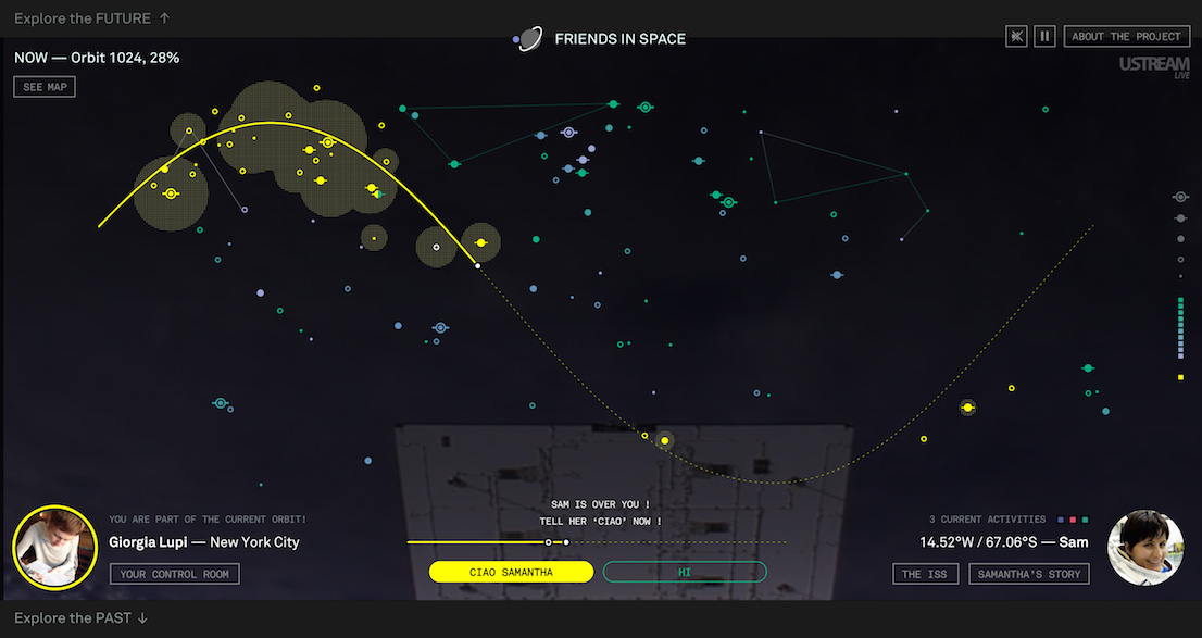
(english text below)
Intervista di / Interview by Francesca Esposito
Parafrasiamo Jep Gambardella. Barnaba Fornasetti non è semplicemente un artista mondano della piazza milanese: è il re degli artisti mondani. Non organizza solo le feste, ha anche il potere di farle trionfare. Classe 1950, figlio del pittore e decoratore milanese Piero Fornasetti, Barnaba è da sempre circondato da una grande bellezza colorata e multiforme. Dopo gli studi all’Accademia di Brera e prima di avviare la collaborazione con il padre, lavora con diversi designer, progetta riviste, fa il direttore creativo. Alla scomparsa di Piero, Barnaba assume la direzione dell’azienda di famiglia rinnovando la tradizione dell’atelier con nuovi prodotti e riedizioni di pregio. Il suo palmarès è fitto di collaborazioni e disegni per piastrelle, mobili, lampade, tessuti, senza dimenticare le tante mostre in giro per il mondo, gli showroom, i libri, la recente retrospettiva alla Triennale di Milano, e, infine, le feste. Anzi, la festa più celebre del Salone del Mobile, quella a cui tutti sperano di essere invitati: “Il successo delle mie serate è dovuto soprattutto a questo nostro tempo in cui nessuno è più capace di organizzare una festa. Il problema però è che anno dopo anno tutti se la aspettano, la festa di fine Salone. E io non sempre ho la voglia e la forza di farla”.
Mi spiega il segreto di una festa di successo in Italia?
È una pura questione di magia, come per il design. Un minimo di organizzazione è indispensabile, ma il successo di una festa dipende essenzialmente da una strana combinazione di fattori non precisabili né programmabili.
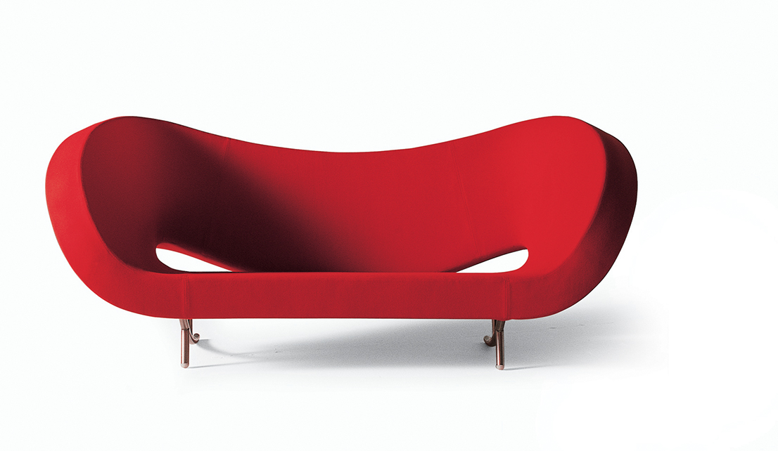
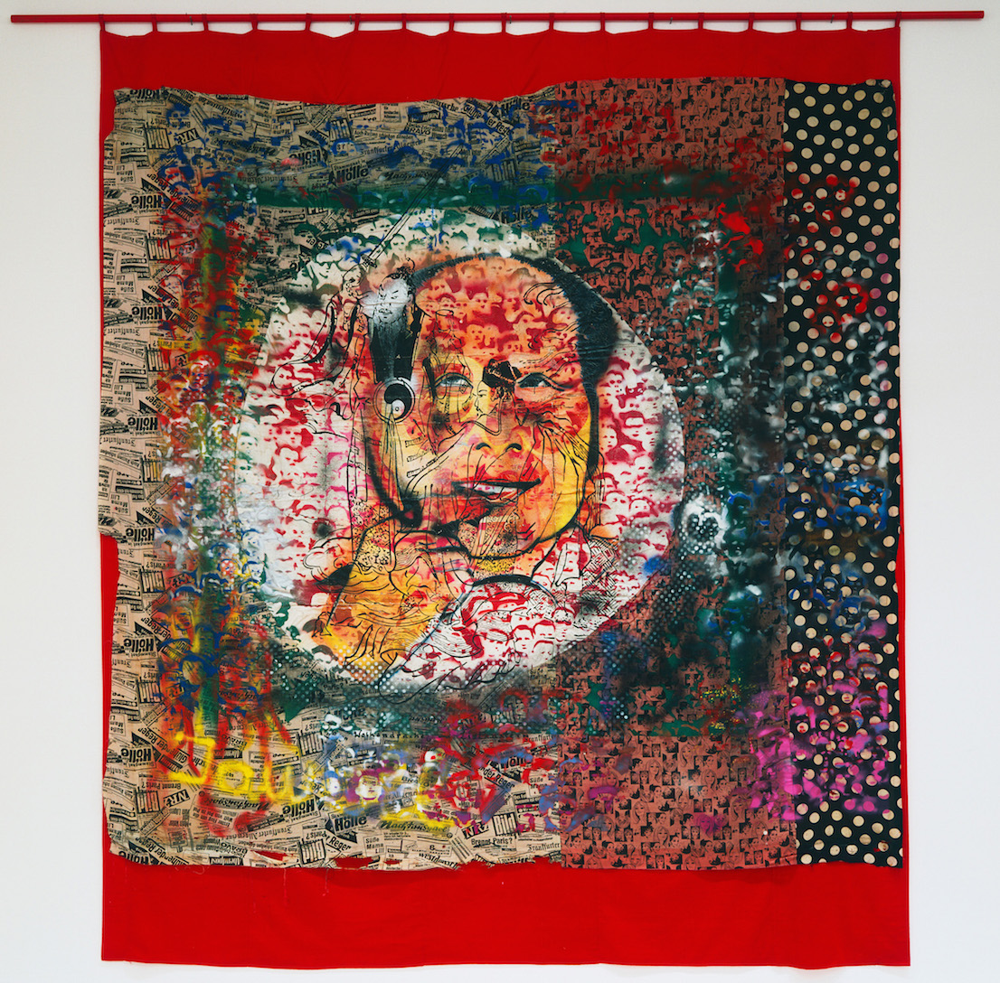
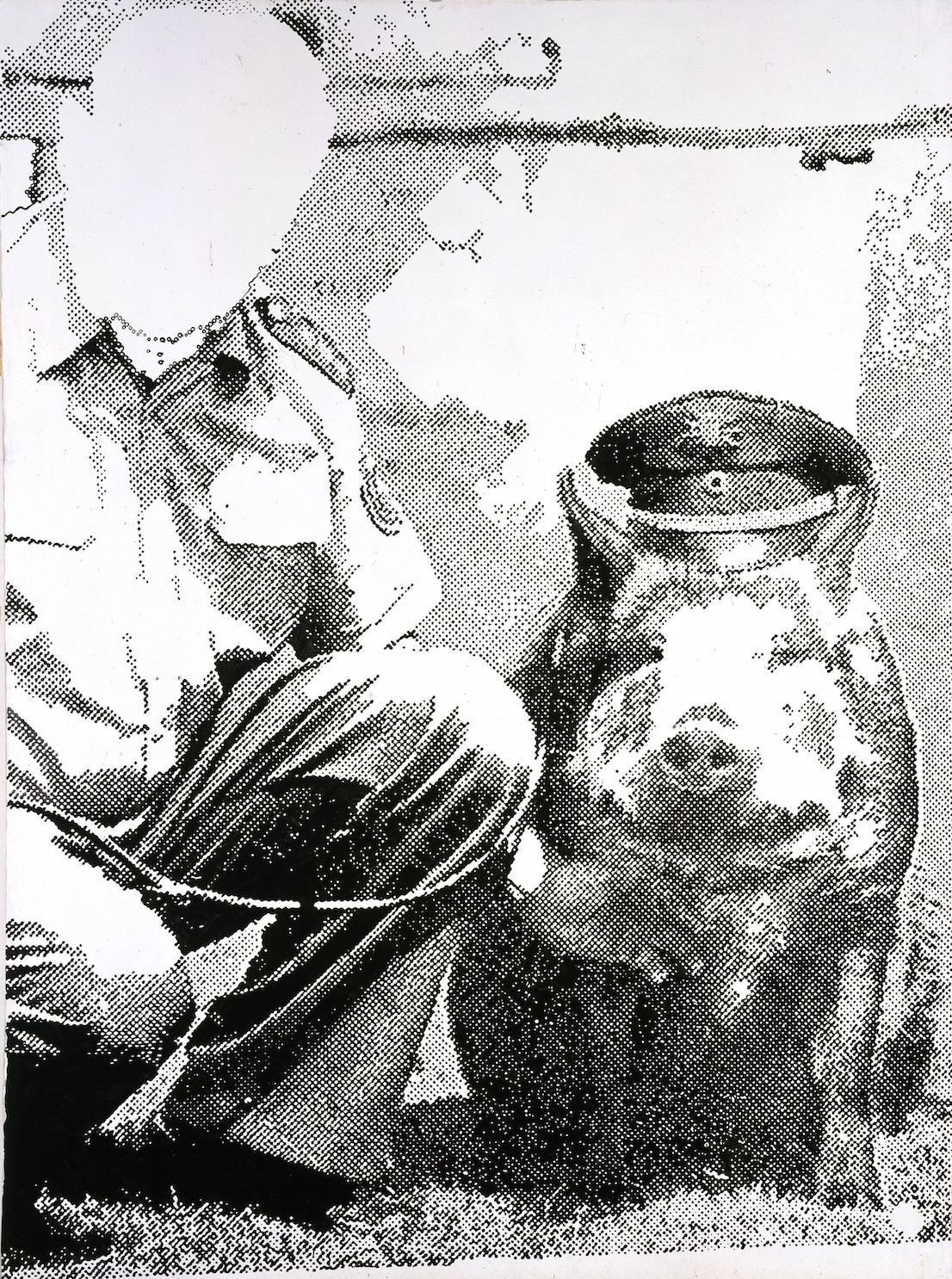
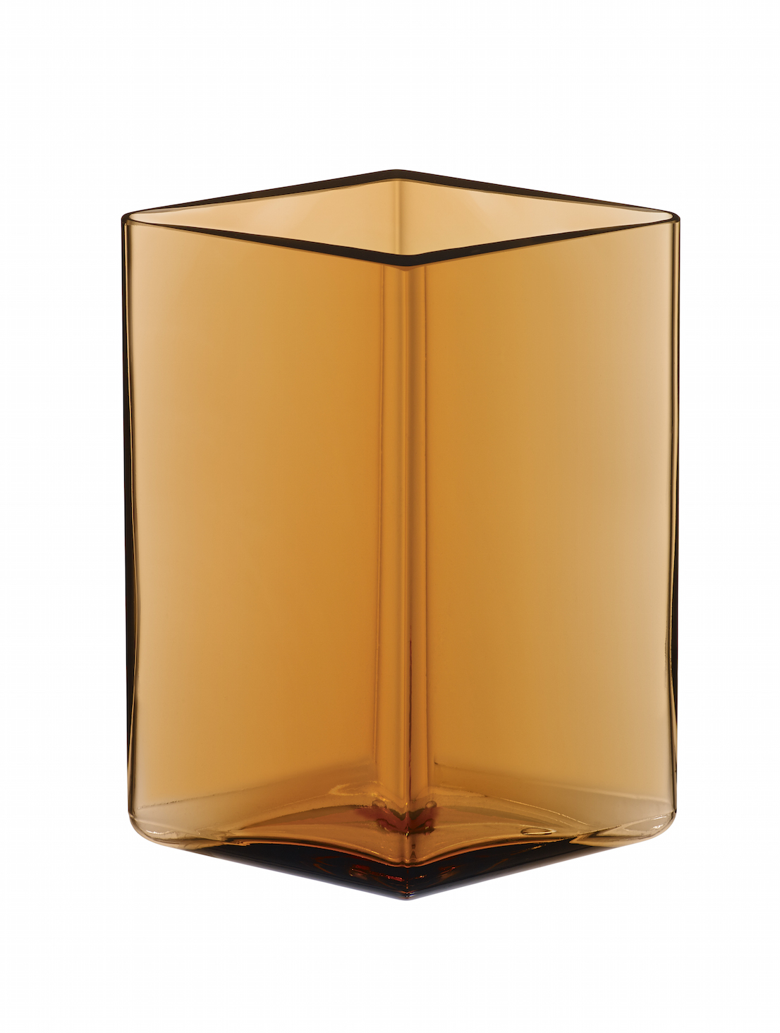
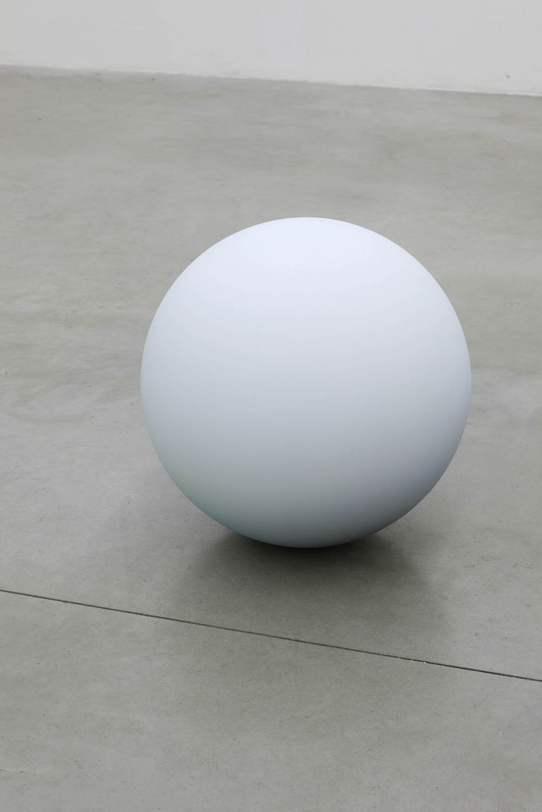
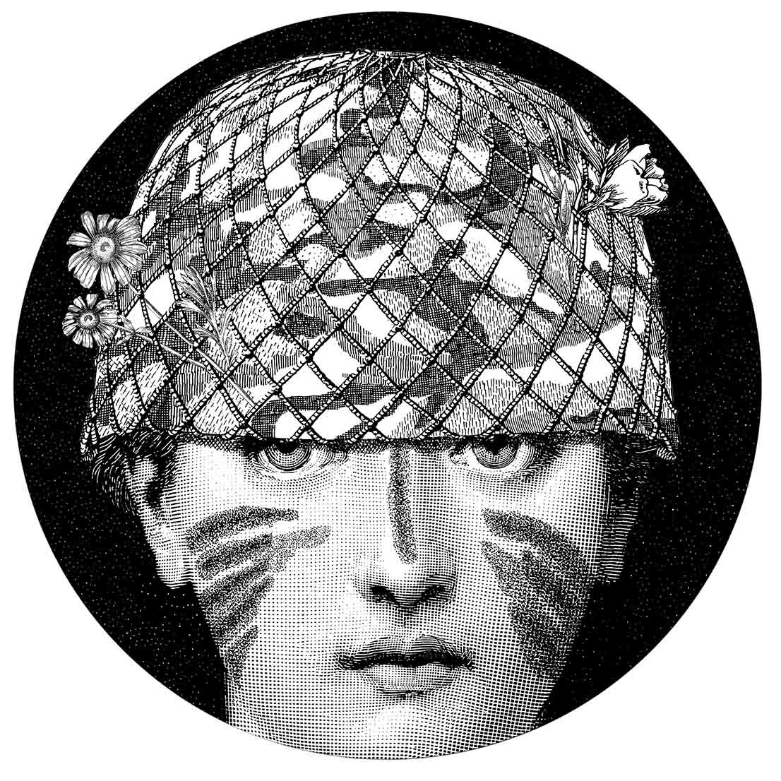
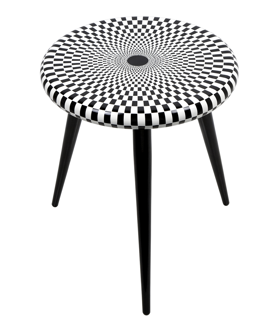
Baciamano entomologia, design di/by Nigel Coates in collaborazione con/in collaboration with Barnaba Fornasetti, 2014.
Solo magia quindi?
Mettiamoci anche il fatto che la organizzo durante il Salone del Mobile, e che è l’ultima festa della manifestazione, quando tutti ormai sono stufi dei party che mirano esclusivamente a propagandare un prodotto. Non voglio fare il santo, anch’io punto ad affermare il mio brand, se così vogliamo chiamarlo. Ma alla mia festa si viene per divertirsi, stare bene e mangiare cose buone. Punto.
Una domanda per chi non rientra nella rosa degli invitati. Com’è la festa?
Guardi, non ci tengo a parlare troppo di questa festa. Quest’anno sono arrivate oltre 700 persone e mi creda, non so più dove metterle. Tutti ne parlano, tutti vogliono esserci, e sono costretto a imporre il numero chiuso che è l’ultima cosa che vorrei fare. Ma la mia è una casa piccola, antica, non so che dire, mi toccherà cambiare mestiere.
Va bene, cambiamo discorso e parliamo del suo vero mestiere, il design. Che ne dice di partire dal senso del Salone del Mobile per Milano?
In realtà, vorrei iniziare in maniera provocatoria come ha fatto Enzo Mari nell’intervista che gli avete dedicato.
Non mi dica che anche lei è comunista.
No, ma mi piacerebbe che il design non fosse l’argomento principale di questa intervista. Comunque, per rispondere alla sua domanda: il Salone del Mobile ha certamente senso perché è l’unico momento in cui Milano diventa una città cosmopolita.
Ed Expo 2015, che inizia fra qualche mese?
Già oggi l’Expo è una prova sconsolante del malcontento italico che speriamo di scrollarci di dosso. Gli italiani hanno questo difetto gigantesco, nonostante la fantasia, la creatività, e i tanti pregi che altri non hanno.
La creatività si eredita in famiglia. Se non sono indiscreta, perché non ha avuto figli?
La mia è stata una scelta consapevole, per la sopravvivenza del pianeta. La terra ha una riserva limitata di prodotti sia alimentari sia energetici. Non sopporto che si continui a parlare di crescita, e per questo ho scelto di non riprodurmi e ho trovato delle mogli che erano d’accordo con me. Cosa aspettiamo a ribellarci nei confronti di chi, per ragioni economiche, continua a inquinare la politica e le altre forme di convivenza?
In che modo ci si ribella?
Ci sono vari modi, violenti e non violenti. Io sono pacifista, ma per la legittima difesa. Anche un buddista in caso di attacco deve potersi difendere.
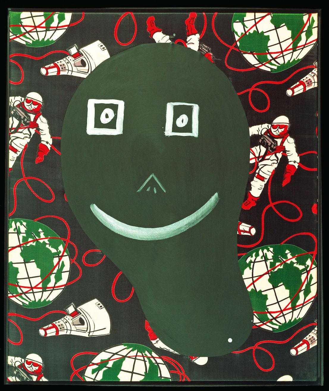
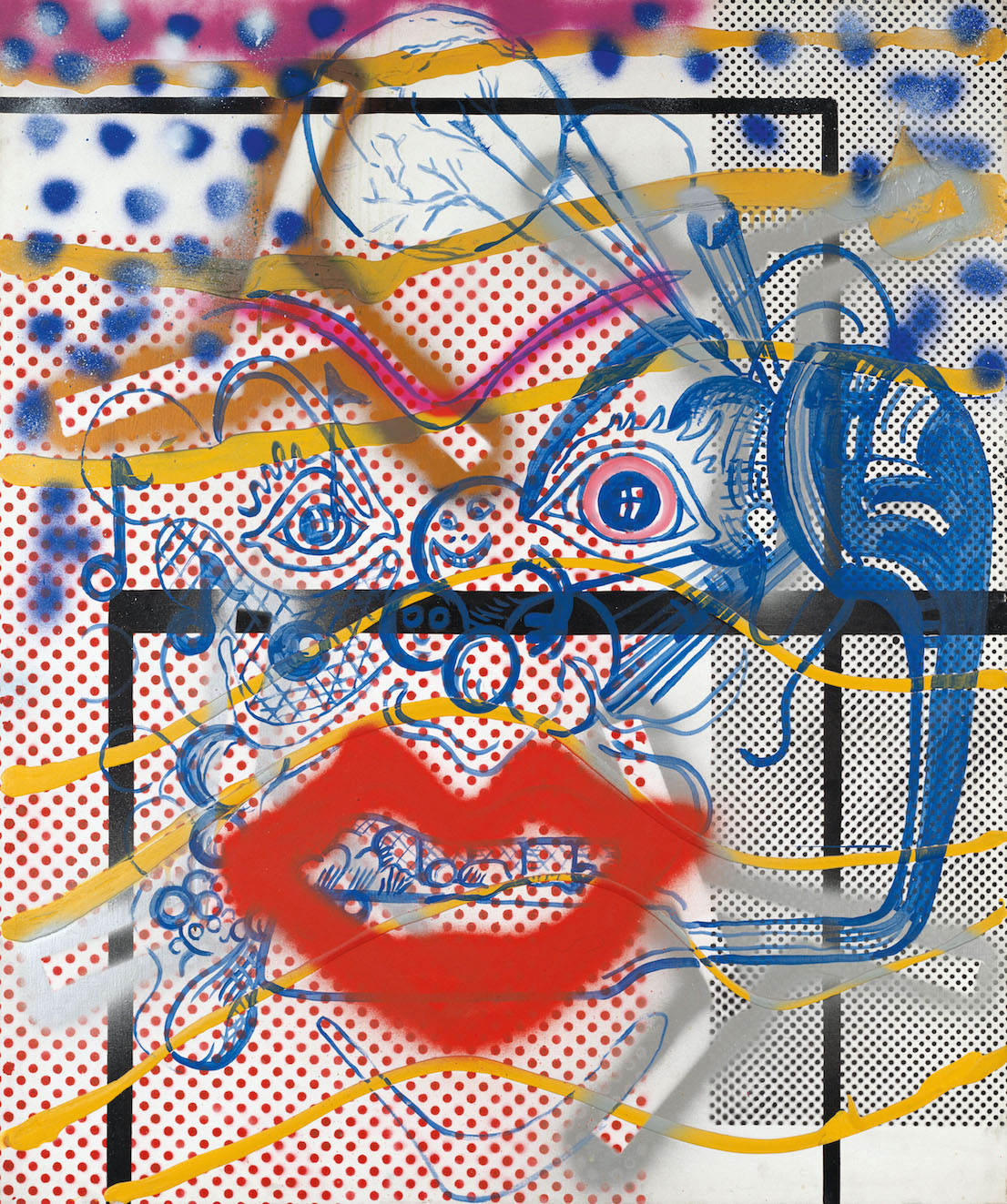
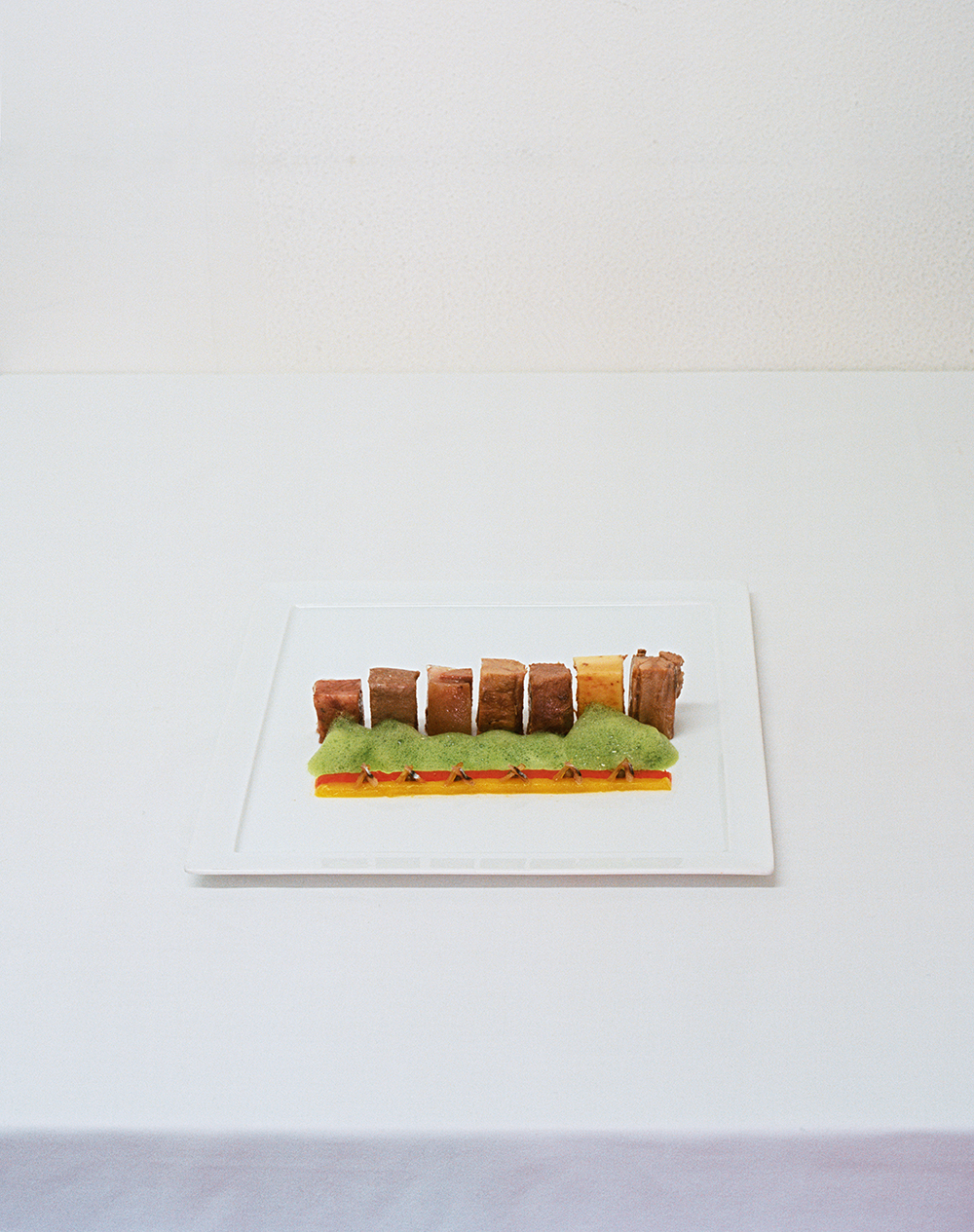
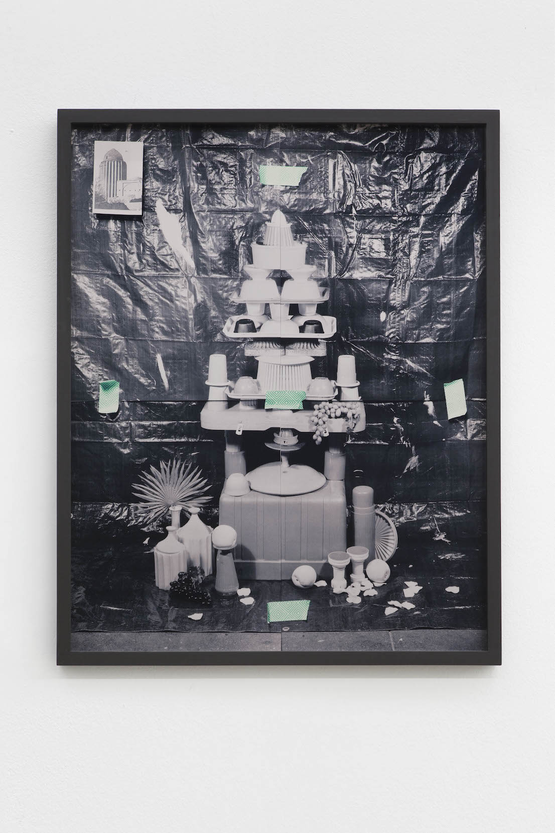
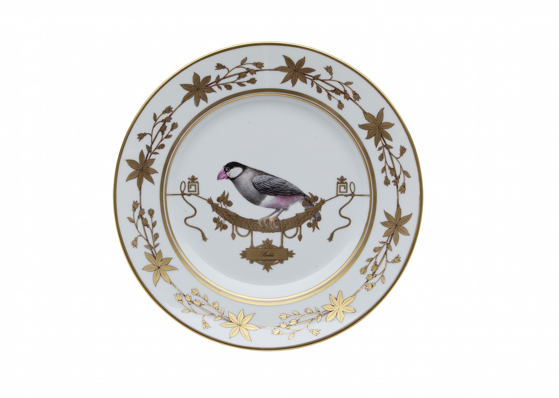
Uno dei piatti della serie Tema & Variazioni, bozzetto di Barnaba Fornasetti, 2014. / One of the dishes from the “Theme and Variations” series, sketch by Barnaba Fornasetti, 2014.
In gioventù è stato un ribelle?
Ho capito presto che la violenza non porta da nessuna parte. Come tutti quelli della mia generazione, ho vissuto anni particolari. Durante una manifestazione del 1969 sono anche finito in galera per motivi politici.
Stava a destra o a sinistra?
A sinistra ovviamente, non potrei mai essere di destra.
Ma come si fa a essere di destra?
Oggi non ha più senso dire sono di destra o di sinistra, e tuttavia essere di sinistra è un dato esistenziale. Ormai si è acquisita una certa immagine, per cui la destra è legata alla corruzione o agli interessi economici. Dai seriamente, cosa c’è di bello a destra?
Non saprei. Cambiamo discorso e parliamo di qualcosa di bello. La retrospettiva – o come la chiama lei, la “retroprospettiva” – in Triennale Piero Fornasetti, 100 anni di follia pratica, curata da lei, ha avuto un successo incredibile. È finita mesi fa, ma se ne parla ancora.
Sì, è stato un evento pazzesco. Ho lottato molto affinché si facesse una mostra sull’opera di mio padre. Alla fine si è fatta in Triennale, nel centenario della nascita, ma per anni ho provato a convincere il Comune ad avviare il relativo iter burocratico. La mostra è stata proposta diverse volte a più amministrazioni, dalla giunta Moratti a quella Pisapia.
Su Piero Fornasetti sono state organizzate altre mostre in giro per il mondo, come quella al Victoria & Albert Museum di Londra. Quella in Triennale però aveva qualcosa di speciale.
La Triennale ci ha anche guadagnato, è stata una delle rare mostre economicamente in attivo pensate a Milano. Il prossimo marzo la portiamo a Parigi, al Musée Des Arts Décoratifs. È piaciuta a un pubblico trasversale: dal bambino di due anni a Gillo Dorfles, che di anni ne ha 104 ed è stato il primo visitatore della mostra.
Com’è stata ideata?
Ne parlavo da anni con Silvana Annicchiarico, direttrice del Triennale Design Museum. Non era scontato che fossi io il curatore, ma abbiamo convenuto che nessuno, meglio di me, poteva conoscere la storia di mio padre. Alla fine Silvana mi ha detto: “La mostra si fa, abbiamo i fondi”. I 37mila visitatori testimoniano di un successo straordinario, l’ultimo giorno c’erano tremila persone. E poi ovviamente festa anche lì.
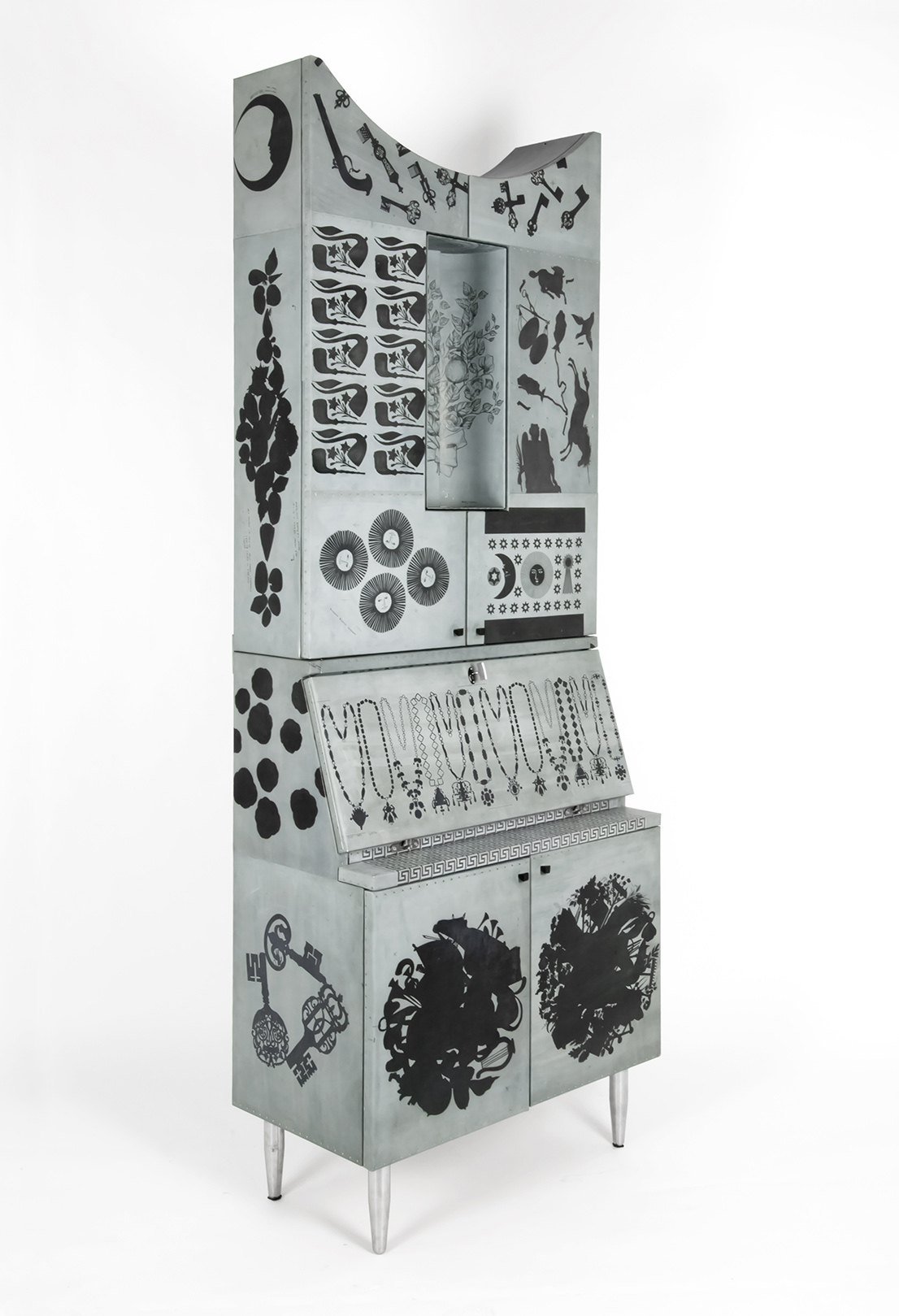
Litomatrice, design di/by Barnaba Fornasetti, 2011.
Vede allora che è il re delle feste?
Una bella festa nel salone principale, riuscitissima, anche senza la classica ambientazione in casa mia.
Due parole sull’allestimento, perfetto per due artisti come lei e suo padre.
L’allestimento lo abbiamo prodotto noi come azienda, dovevamo stare sotto una certa cifra – meno di 40mila euro –, ma l’obiettivo era che tutto riuscisse perfettamente.
Come azienda ci avete guadagnato?
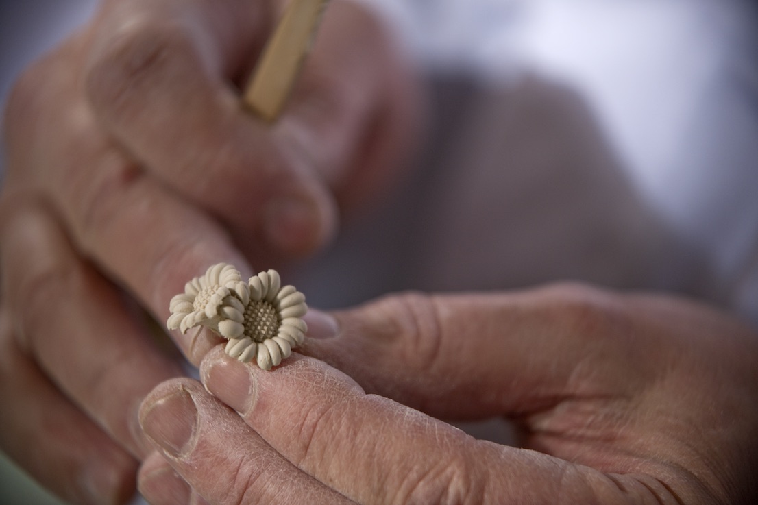
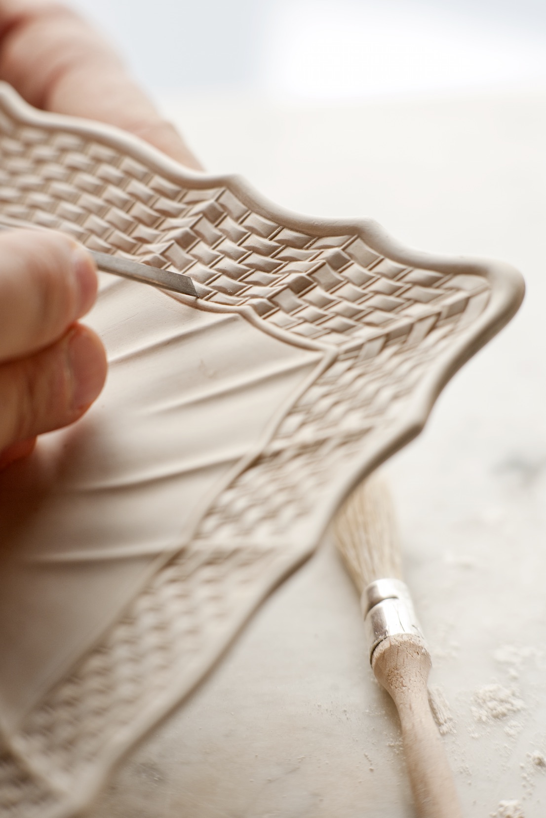
Il riscontro è stato enorme. Gli ordini sono aumentati in maniera esponenziale, tanto che non sappiamo più come farvi fronte. Per sfornare i nostri prodotti non basta acquistare un altro macchinario o assumere un’altra persona. Ci vogliono anni di tirocinio, piccoli segreti artigianali che nessuno svela con facilità.
Le dà fastidio parlare del rapporto con suo padre?
No, fastidio no. Ma è una domanda ricorrente, come per esempio il rapporto fra Piero Fornasetti e Gio Ponti. Quella è fissa.
Va bene, la saltiamo. Mi interessa invece il suo rapporto con la botanica, so che ha un giardino meraviglioso e che piante e fiori sono una sua costante fonte di ispirazione.
È una passione venuta con l’età. Avere un giardino è come usare una tavolozza, anche lì faccio del design usando forme e colori. Il bello è che si tratta di slow design. Non puoi piantare un seme e pretendere che fiorisca subito la piantina. Devi aspettare, è una scuola di pazienza.
Courtesy: Archivio Fornasetti.
Così riscopre ritmi più naturali.
Sì, il problema è proprio che abbiamo disimparato il ritmo della natura. L’essere umano punta alla massima velocità, ma genera solo perversione: ha creato una sorta di metastasi che sta divorando il pianeta. Si arrabatta oggi per rimediare agli errori che ha fatto ieri. Recentemente ho letto di un ragazzo che ha trovato un modo per eliminare la plastica dal mare: quello sì che è vero design.
Che fare, quindi?
Smettiamo di usare la plastica in maniera stupida, altrimenti è inutile poi mangiare cibi biologici.
Quando ha maturato questa consapevolezza?
Appartengo a una generazione che già negli anni Sessanta lottava per queste cose e veniva ridicolizzata. Governi e istituzioni hanno sviluppato una certa sensibilità ecologica solo negli anni Ottanta. Vogliamo parlare dei no global?
Parliamo dei no global.
Quanto sono stati maltrattati i no global! Che poi alla fine avevano ragione su tutto. Ma più che di problemi politici, si tratta di elementi fisiologici con i quali è indispensabile confrontarsi. Io comunque rimango ottimista.
Quali sono i segnali che la fanno ben sperare?
Per esempio, il fatto che molte aziende si accorgono che non conviene più andare in Cina e tornano a produrre qui, tramandando il know-how italiano prima che si perda definitivamente. Il mio direttore di produzione è senegalese, è arrivato in Italia che spazzava per terra. Ma aveva voglia di lavorare ed è riuscito a rubare i segreti dal suo predecessore pugliese.
C’è del buono in Italia, dunque.
Ci sono realtà importanti che dimostrano una crescita materiale e spirituale. Il punto è non realizzare solo prodotti di consumo: ne parlavamo già negli anni Sessanta, e ne scrivevano Herbert Marcuse e Pier Paolo Pasolini.
Cosa pensa delle nuove generazioni?
Poveracci, sono messi malissimo. Anche se a volte mi capita di confrontarmi con dei ragazzini che mi sorprendono e mi fanno sperare in un ritorno alla manualità, all’antico, al design. Poi però ci sono anche i rincoglioniti, gli omologati.
Lei oggi vive e lavora a Milano. Perché proprio qui e non altrove?
Perché ho trovato qui il mio lavoro. In realtà, c’è stato un momento in cui volevo comprare un castello a Larderello, in Toscana, dove ci sono i soffioni boraciferi. Era una casa colonica disegnata dall’architetto francese che aveva progettato la centrale geotermica dell’Enel. Avrei voluto lasciare a Milano solo il negozio e spostare lì tutto il resto, trasformando il castello in beauty farm, produzione, godimento totale.
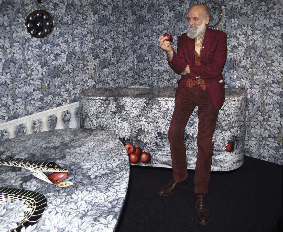
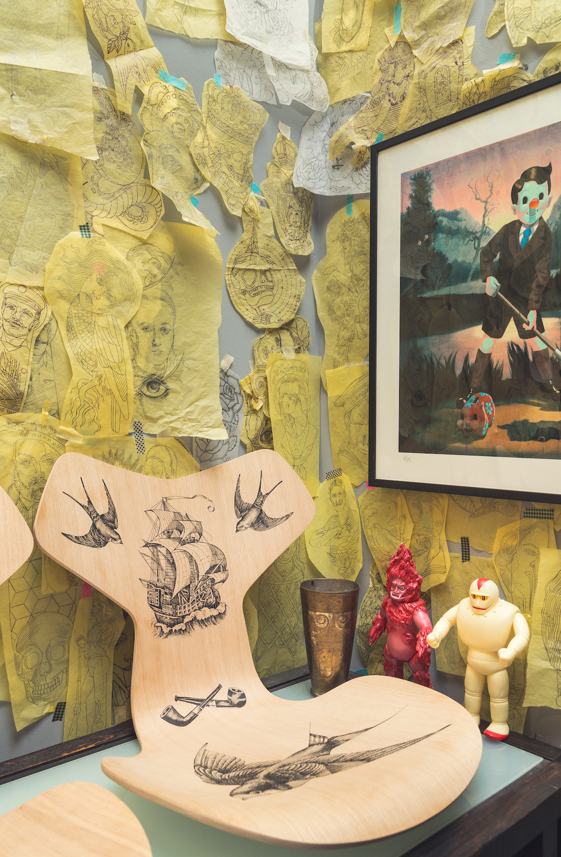
Barnaba Fornasetti nel suo showroom di corso Matteotti per la presentazione della collezione “Frutto del peccato” durante il Fuorisalone 2013. / Barnaba Fornasetti in his showroom on Corso Matteotti for the presentation of the “Fruit of Sin” collection during FuoriSalone 2013.
E alla fine?
Alla fine Milano. La mia è una piccola azienda, all’esterno può sembrare gigantesca, ma ha un fatturato ridicolo anche se in costante, leggera crescita. I mezzi sono limitati, anche perché mio padre mi ha lasciato un mare di debiti. È stato un genio, ma dal punto di vista economico e finanziario era un disastro.
Mi parli di lui.
Era un creativo sognante ed egocentrico, aveva un carattere difficile, ma sapeva essere anche tenerissimo. Non accettava compromessi, e me lo ricordo che cacciava a male parole chi entrava nel negozio di Brera chiedendo i pezzi anni Cinquanta fatti con Gio Ponti. La sua classica risposta era: “Andate via, siete delle merde, siete dei corrotti, avete rovinato Brera”. Ma per questo ha pagato il suo prezzo.
Anche con lei litigava?
Sì, infatti ho cominciato a lavorare con lui quando ormai era anziano e si era addolcito.
Quando lei era giovane com’era suo padre?
Non era di sinistra, gli piaceva Prezzolini, comprava Il Borghese, amava Montanelli che per me era il nemico numero uno. Quando fui arrestato ebbe un attimo di perplessità. Non gli sembrava possibile che io avessi picchiato settanta agenti, o tirato pietre e bombe. Fu lì che iniziò a diffidare delle forze dell’ordine. Poi finì per andare in Statale a parlare con i ragazzi, era in prima linea.
Un rapporto conflittuale?
Quando ero piccolo pensava di temprarmi il carattere con un’educazione molto dura. Ma avere un’istitutrice non è servito a nulla, perché sono diventato un ribelle a prescindere.
E suo padre era un ribelle, a modo suo?
Era antifascista, non sopportava certe assurde manifestazioni del regime, verso la fine della guerra scappò addirittura in Svizzera. Sotto i bombardamenti, comunque, aveva adocchiato cose interessanti: mentre gli altri cercavano il cibo, lui cercava oggetti da collezione nelle case antiche.
Cosa adocchiava?
Quando mi parlava dei bombardamenti, gli venivano in mente lampadari e camini di pietra. Amava quelle cose nate da un antico sapere.
Torniamo sempre lì, bisognerebbe recuperare la conoscenza artigianale.
Oggi nessuno ha più voglia di sporcarsi le mani.
Piero Fornasetti. Courtesy: Archivio Fornasetti.
Le interviste servono per trovare soluzioni, mi dia un paio di soluzioni.
Bisogna convincere i giovani che vale la pena recuperare certe abilità. E poi allontanare l’ignoranza e la politica del terrore.
Un’ultima cosa: come fare per essere invitati alla festa del prossimo anno?
Non so se la faccio, forse pioverà.
Deve farla, è una tradizione.
In azienda siamo in una fase difficile, dopo mio padre e dopo di me non ci sarà una terza generazione. Spero di avere più tempo da dedicare a quello che mi piace fare. Mi creda, il vero lusso è il tempo. Ne parliamo la prossima volta, alla festa magari.
/
Parties, Exhibitions, Right and Left
To paraphrase Jep Gambardella, Barnaba Fornasetti is not simply an artist of the high life in the marketplace of Milan: he is the king of artists of the high life. He doesn’t just organize parties, he has the power to make them a success. Born in 1950, son of the Milanese painter and interior decorator Piero Fornasetti, Barnaba has always been surrounded by a colorful and many-sided great beauty. After studying at the Accademia di Brera and before embarking on the collaboration with his father, he worked with several designers, on magazines, as a creative director. On Piero’s death, Barnaba took over the family business, renewing the tradition of the studio with new products and reissues of quality pieces. His track record is studded with collaborations and designs for tiles, furniture, lamps and textiles, without forgetting the many exhibitions around the world, the showrooms, the books, the recent retrospective at the Milan Triennale and, finally, the parties. Indeed, the most celebrated party at the Salone del Mobile, the one to which everyone hopes to be invited: “The success of my soirées is due primarily to this time of ours in which no one is able to organize a party any longer. The problem, however, is that year after year everyone is expecting the end-of-Salone party. And I don’t always have the desire and the strength to do it.”
Can you explain to me the secret of a successful party in Italy?
It’s purely a question of magic, as with design. A minimum of organization is indispensable, but the success of a party depends essentially on a strange combination of factors that cannot be clearly defined or orchestrated.
Just magic then?
Let’s recognize too that I organize it during the Salone del Mobile, and that it’s the last party of the event, when everyone is fed up with parties that are intended exclusively to publicize a product. I’m no saint, I also want to promote my brand, if that’s what we want to call it. But people come to my party to have fun, enjoy themselves and eat good things. That’s all.
High Fidelity, design di/by Barnaba Fornasetti, 2007.
A question on behalf of those who are not on the guest list. What’s the party like?
Listen, I don’t like to talk too much about this party. This year over 700 people turned up and believe me, I don’t know where to put them anymore. Everyone talks about it, everyone wants to be there, and I’m forced to put a limit on the numbers, which is the last thing I want to do. But my home is small, and old. I don’t know what to say, I’ll have to change my job.
OK, let’s change the subject and talk about your real job, design. What do you think about starting out with the meaning of the Salone del Mobile for Milan?
In reality, I’d like to begin in provocative fashion as Enzo Mari did in the interview you conducted with him.
Don’t tell me that you’re a Communist too.
No, but I’d like design not to be the main subject of this interview. In any case, to answer your question: the Salone del Mobile is certainly important because it is the only moment at which Milan becomes a cosmopolitan city.
And Expo 2015, which starts in a few months?
The Expo is already a depressing example of the Italian discontent that we are hoping to shake off. Italians have this gigantic defect, notwithstanding the imagination, the creativity and the many qualities that others don’t have.
Creativity is passed down in the family. If it’s not indiscreet to ask, why have you no children?
It was a conscious choice, for the survival of the planet. The Earth has a limited supply of both food and energy. I can’t stand it that people go on talking about growth, and so I have chosen not to reproduce and I’ve found wives who agreed with me. What is stopping us from rebelling against those who, for economic motives, continue to corrupt politics and the other forms of coexistence?
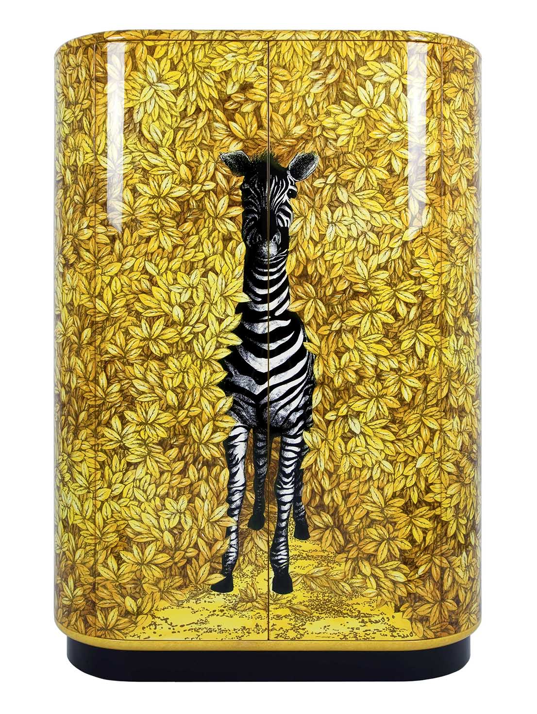
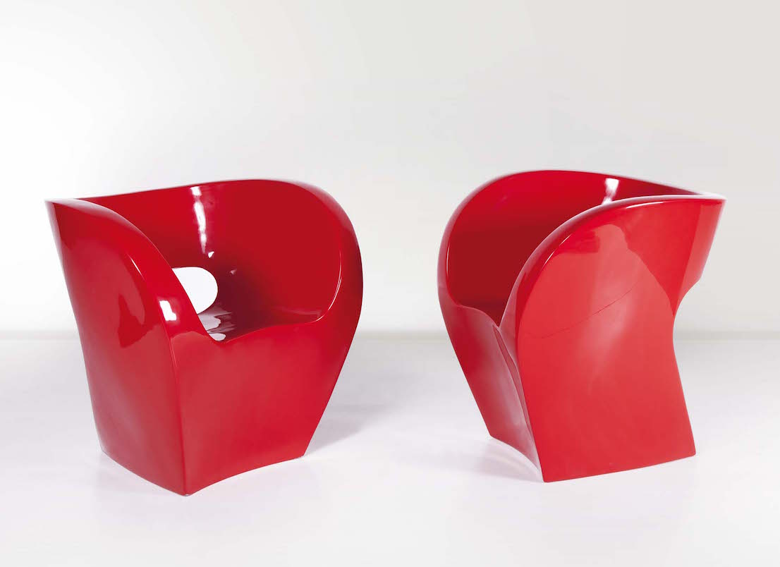
Zebra, design di/by Barnaba Fornasetti, 2003.
In what way can we rebel?
There are various ways, violent and not violent. I’m a pacifist, but in self-defense... Even a Buddhist has to be able to defend himself when attacked.
Were you a rebel in your youth?
I quickly realized that violence gets you nowhere. As for all those of my generation, it was a peculiar time. At a protest in 1969 I was arrested for political reasons and ended up in jail.
Were you on the right or the left?
On the left obviously, I could never be on the right.
But how is it possible for people to be on the right?
Today it no longer makes sense to say I’m on the right or the left, and yet being on the left is an existential fact. By now a certain image has been established, in which the right is linked to corruption or to economic interests. Seriously, what is there that’s good on the right?
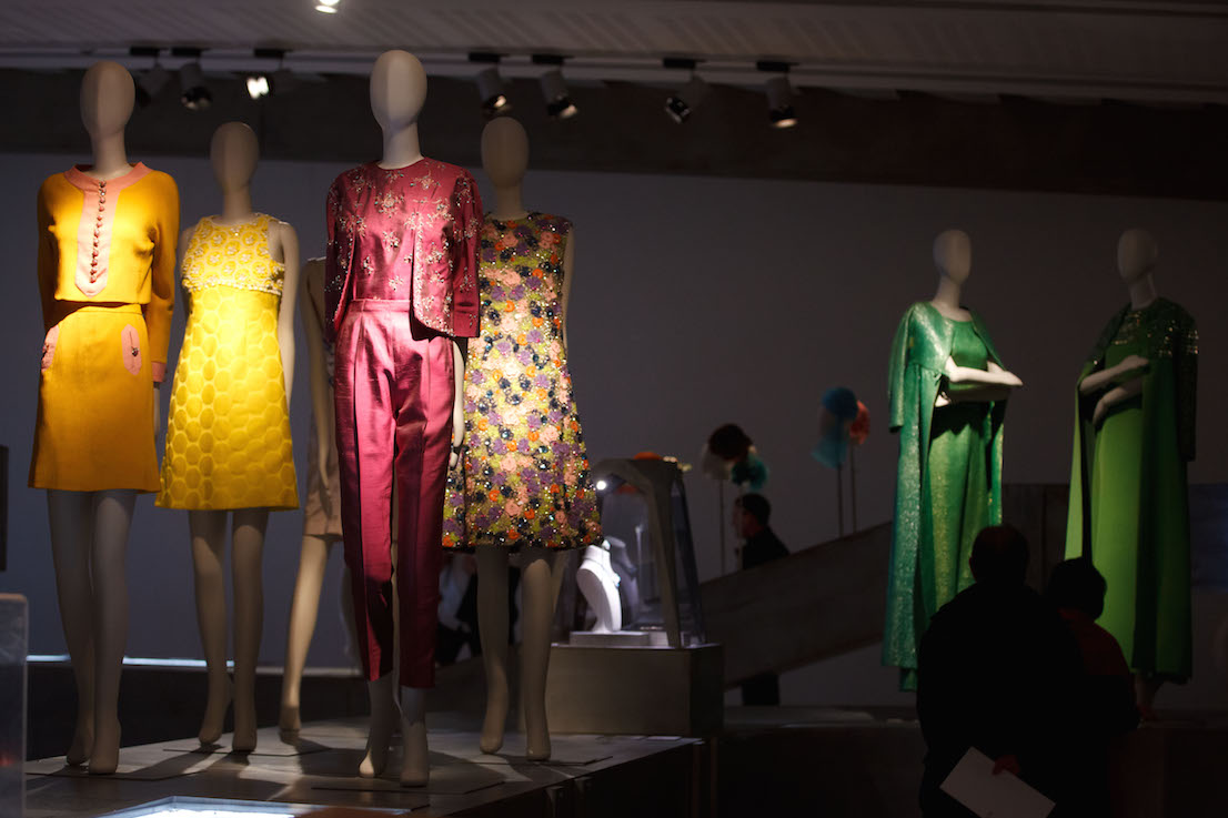
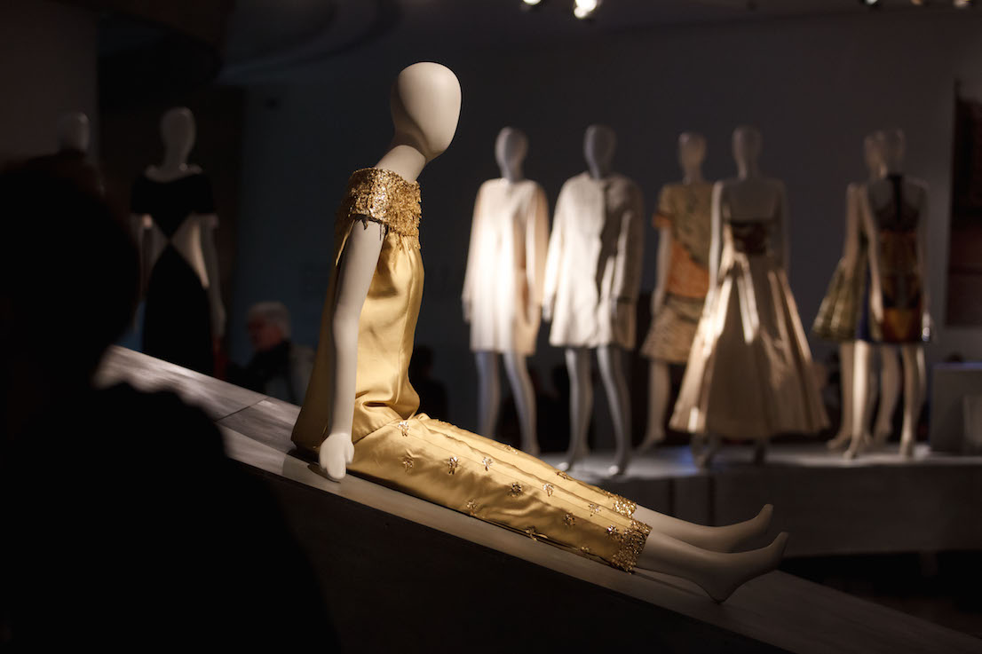
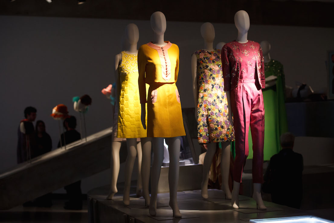
I wouldn’t know. Let’s change the subject and talk about something beautiful. The retrospective—or as you call it, the “retroprospective”—at the Triennale Piero Fornasetti, 100 Years of Practical Madness, which you curated, has been an incredible success. It ended months ago, but people are still talking about it.
Yes, it was an amazing event. I made a lot of effort to get an exhibition staged on the work of my father. In the end it was held at the Triennale, on the centenary of his birth, but I had been trying for years to convince the municipality to set the bureaucratic process in motion. The exhibition was proposed several times to more than one administration, from Moratti’s to Pisapia’s.
Other exhibitions on Piero Fornasetti have been organized around the world, like the one at the Victoria & Albert Museum in London. But there was something special about the one at the Triennale.
The Triennale even made money out of it. It was one of the few exhibitions to have made a profit in Milan. Next March we’re taking it to Paris, to the Musée des Arts Décoratifs. And it was popular with a broad section of the public: from two-year-old children to Gillo Dorfles, who is 104 and was the first visitor to the exhibition.
How was it conceived?
I’d been talking about it for years with Silvana Annicchiarico, director of the Triennale Design Museum. It wasn’t a foregone conclusion that I would be the curator, but we agreed that no one could have a better understanding of my father’s story than me. Eventually Silvana told me: “The exhibition is on, we have the funds.” The 37 000 visitors are evidence of its extraordinary success. There were three thousand people on the last day. And obviously a party there too.
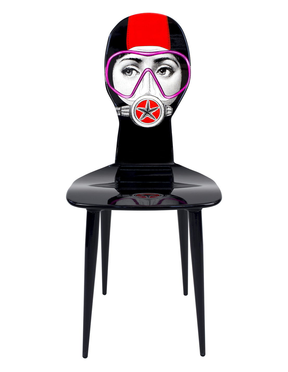
Silviasub, design di/by Barnaba Fornasetti, 2014.
So it’s true that you’re the king of parties?
A great party in the main hall, which went off very well, even though it wasn’t in the traditional setting of my home.
A few words on the way the exhibition was mounted, perfect for two artists like you and your father.
As a company we were responsible for preparing the exhibition. We had to keep under a certain figure—less than 40 thousand euros—but the aim was for everything to work perfectly.
As a company have you made money from it?
The response has been huge. Orders have gone up exponentially, to the point where we don’t know how to cope with them. To turn out our products it’s not enough to acquire another machine or hire another person. It takes years of training, little secrets of craftsmanship that no one reveals readily.
Does it bother you to talk about your relationship with your father?
No, it doesn’t bother me. But it’s a recurrent question, as is the one about the relationship between Piero Fornasetti and Gio Ponti. That’s a fixed one.
OK, we’ll skip it. What interests me instead is your relationship with botany. I know you have a marvelous garden and that plants and flowers are a constant source of inspiration for you.
It’s a passion that came with age. Having a garden is like using a palette, I am doing design there too, using forms and colors. What’s beautiful is that it is a form of slow design. You can’t plant a seed and expect the plant to sprout at once. You have to wait, it’s a school in patience.
So you rediscover more natural rhythms.
Yes, the problem is precisely that we have lost touch with the rhythm of nature. Human beings aim for the greatest speed, but generate only perversion: it has created a sort of metastasis that is devouring the planet. Today we struggle to remedy the mistakes made in the past. Recently I read about a young man who has found a way of eliminating plastic from the sea: now that is real design.
What can we do, then?
Stop using plastic in a stupid way, otherwise what’s the point in eating organic food.
When did this awareness start to emerge?
I belong to a generation that was already fighting for these things in the sixties and was laughed at. Governments and institutions only began to develop an appreciation of the environment in the eighties. Do you want to talk about the global justice movement?
Egocentrismo, design di/by Barnaba Fornasetti, 2005.
Let’s talk about the global justice movement.
How badly the anti-globalists have been treated! And in the end they were right about everything. But rather than political problems, it’s a matter of structural elements that have to be dealt with. However, I remain optimistic.
What is it that gives you hope?
For instance, the fact that many companies are realizing that it no longer makes sense to go to China and are bringing their production back here, ensuring that Italian knowhow is handed down before it is lost forever. My production manager is from Senegal, he used to sweep the streets when he arrived in Italy. But he wanted to work and was able to steal the secrets of his predecessor from Puglia.
So there are good things in Italy.
There are important undertakings that are demonstrating material and spiritual growth. The point is not to just make consumer products: we were already talking about it in the sixties, and Herbert Marcuse and Pier Paolo Pasolini wrote about it.
What do you think of the new generations?
Poor things, they are in a really bad way. Although I sometimes come across young people who surprise me and allow me to retain hope in a return to manual skill, to the old ways, to design. But then there are also the dumbasses, the conformists.
Today you live and work in Milan. Why here and not somewhere else?
Because it’s here I’ve found my work. In reality, there was a time when I wanted to buy a castle at Larderello, in Tuscany, where the boric-acid fumaroles are. It was a manor house designed by the French architect who had designed the geothermal power plant for ENEL. I would have liked to leave just the store in Milan and move all the rest there, turning the castle into a beauty farm, a production facility, a total delight.
And in the end?
In the end Milan. My company is a small one. From the outside it might seem gigantic, but it has a ludicrous turnover, even if it is constantly growing slightly. The means are limited, in part because my father left me a mountain of debt. He was a genius, but from the business and financial point of view he was a disaster.
Tell me about him.
He was a creative man, an egocentric dreamer. He had a difficult character, but he could also be very loving. He wasn’t willing to compromise, and I remember him chasing away in a hail of insults anyone who entered the store in Brera asking for the pieces he had made with Gio Ponti in the fifties. His classic answer was: “Get out, you are pieces of shit, you are crooks, you have ruined Brera.” But he paid a price for this.
Did he quarrel with you too?
Yes, in fact I started to work with him when he was already old and had mellowed.
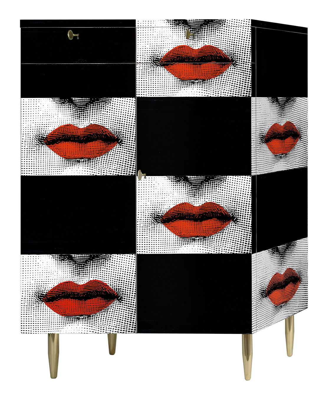
Kiss, design di/by Barnaba Fornasetti, 2006.
What was your father like when you were young?
He wasn’t on the left. He liked Prezzolini, bought Il Borghese and adored Montanelli, who for me was enemy number one. When I was arrested he had a moment of doubt. It didn’t seem possible to him that I had hit seventy police officers, or thrown stones and bombs. It was at that time that he started to distrust the police. Then he ended up going to the public school to talk to the students, he was on the front line.
A turbulent relationship?
When I was small he thought he could strengthen my character with a very strict upbringing. But having a governess was no use, because I became a rebel regardless.
And was your father a rebel, in his own way?
He was an antifascist, he couldn’t bear some of the regime’s absurdities. Toward the end of the war he even fled to Switzerland. Under the bombs, however, he had spotted interesting things: while others looked for food, he went searching for collectibles in the old houses.
What was it he spotted?
When he talked to me about the bombing raids, what came to his mind were chandeliers and stone fireplaces. He loved those things born out of an ancient knowledge.
We always come back to the same thing, the need to revive craft knowhow.
Today no one is willing to get their hands dirty.
Interviews serve to find solutions, give me a couple of solutions.
The young need to be convinced that it’s worth recovering certain skills. And then get rid of ignorance and the politics of terror.
One last thing: what do I have to do to be invited to next year’s party?
I don’t know if I’m going to have one, perhaps it’s going to rain.
You have to do it, it’s a tradition.
We’re going through a difficult phase in the company. After my father and me there is not going to be a third generation. I hope to have more time to devote to what I like doing. Believe me, the real luxury is time. We’ll talk about it next time, maybe at the party.
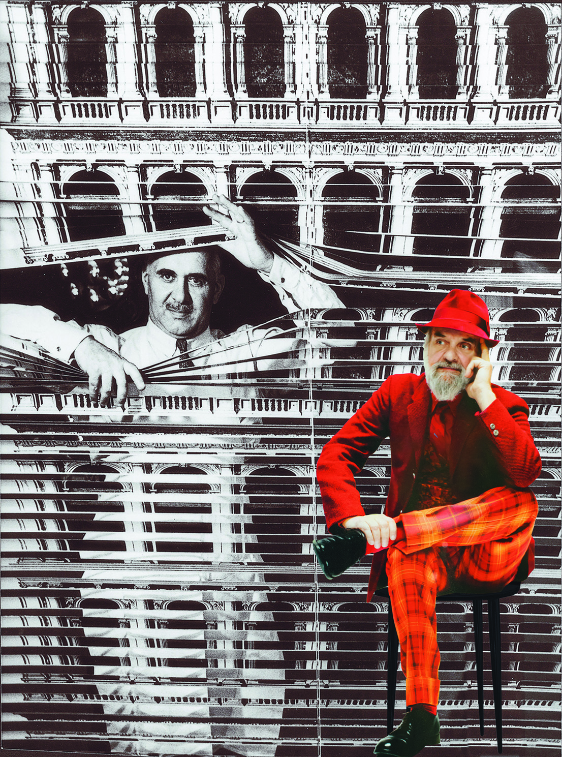
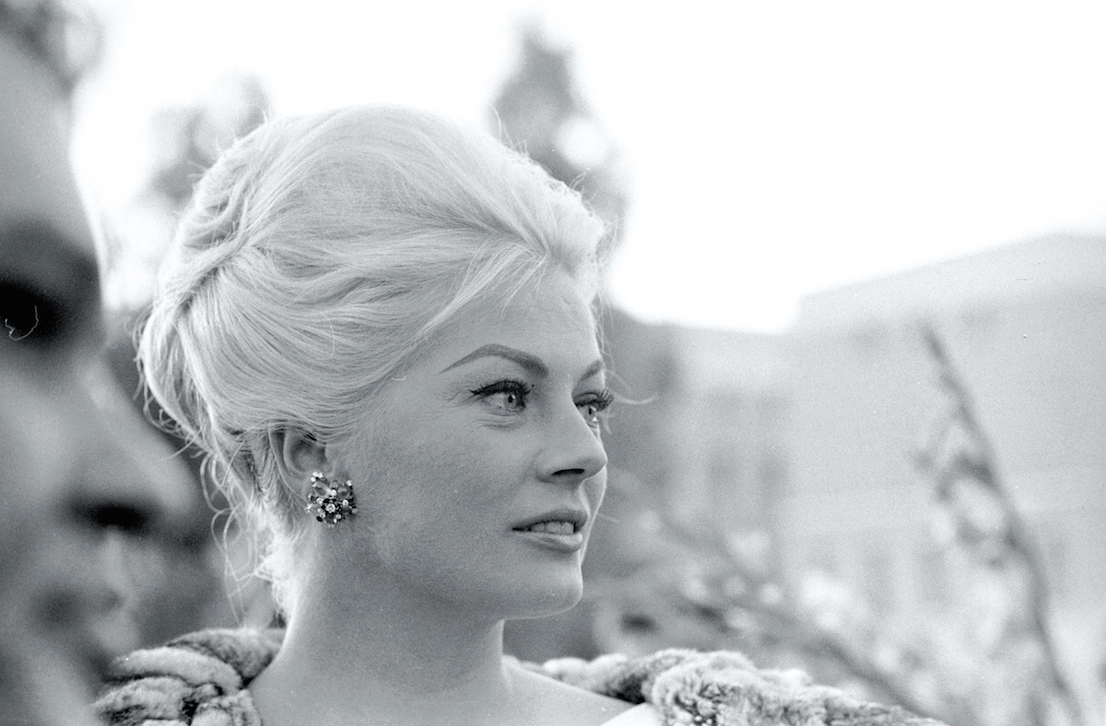
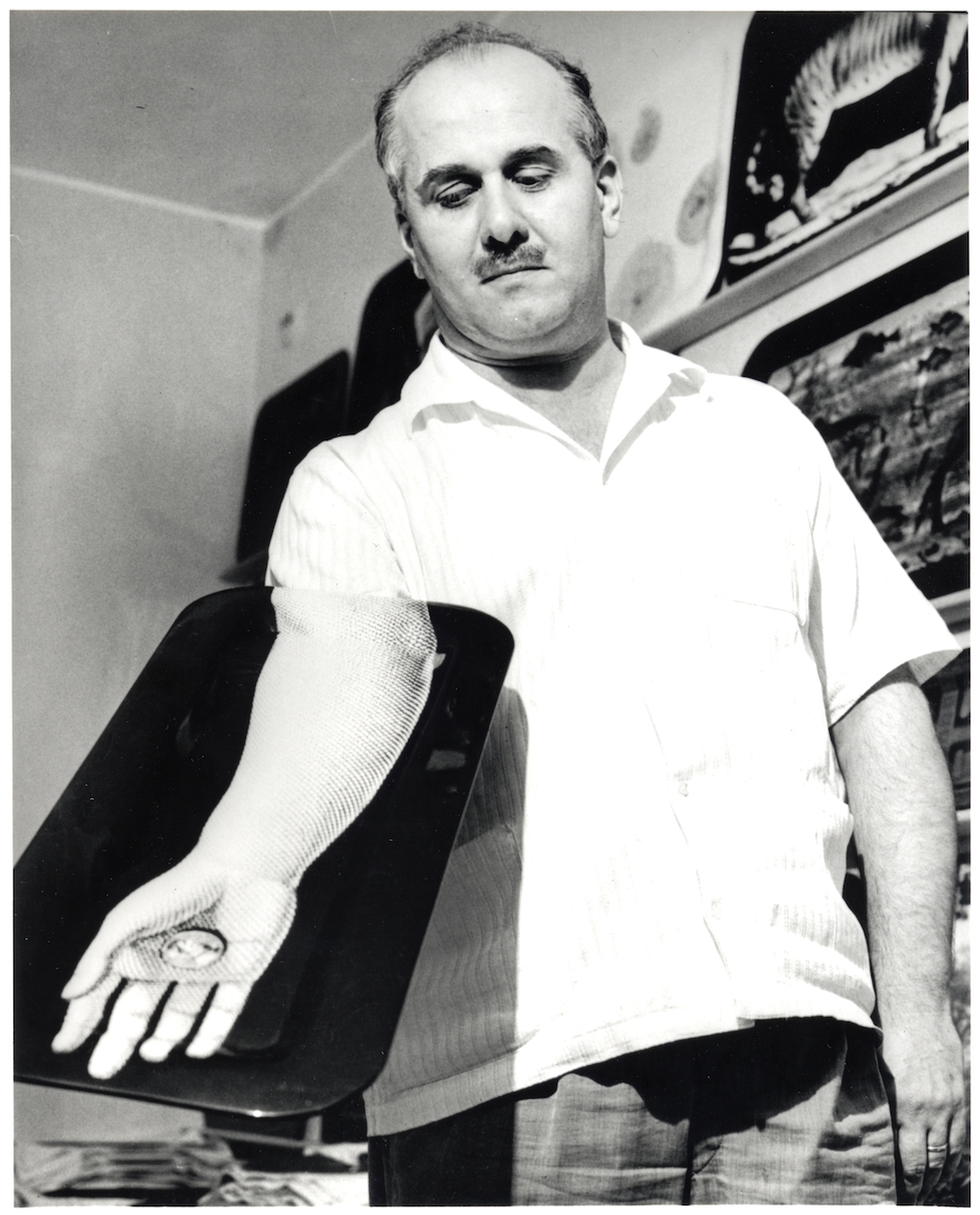
Barnaba Fornasetti. Photo: Giovanni Gastel e/and Ugo Mulas.